Brand Positioning Brand Naming Brand Identity Brand Packaging Launch Campaign Strategy Campaign Materials Social Media Venue & Signage Design Print & Digital Campaign Photography Art Direction Guidelines & Design Tools
Understand / analyse
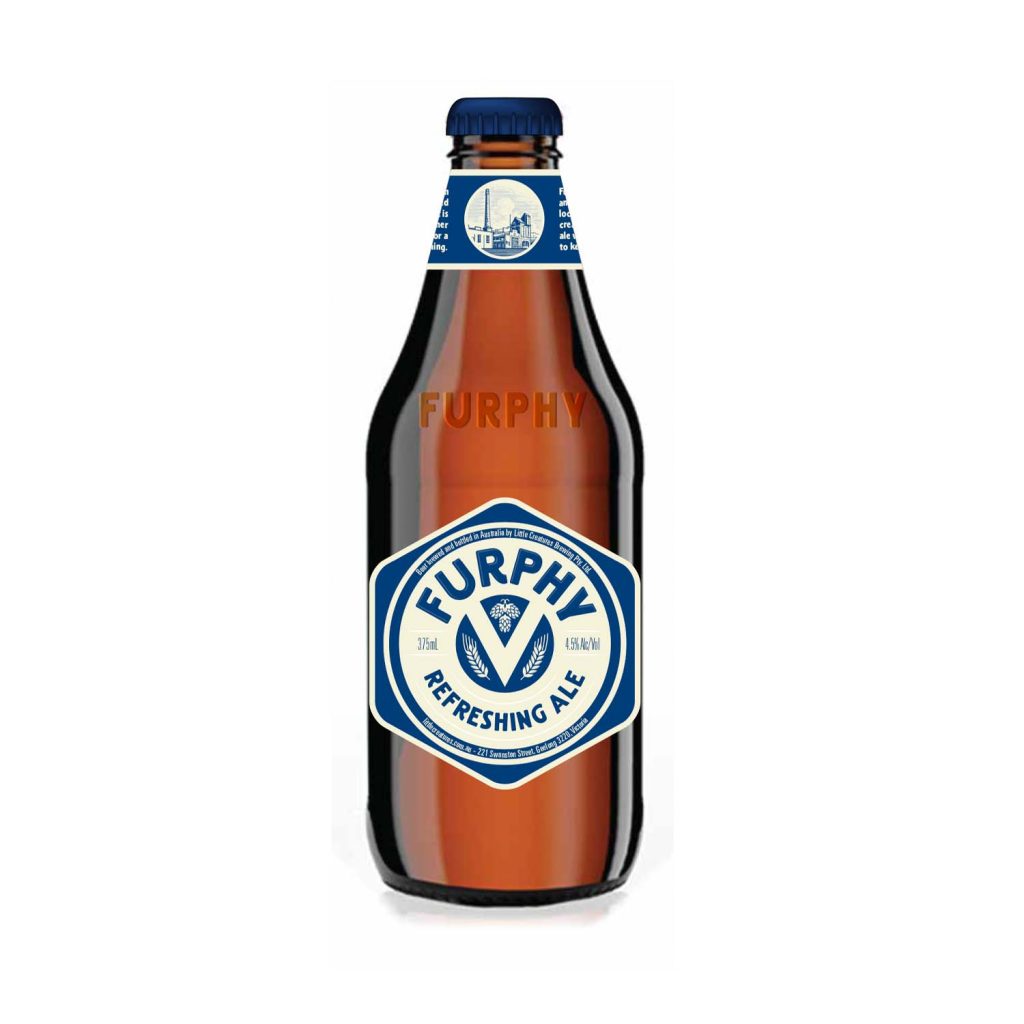
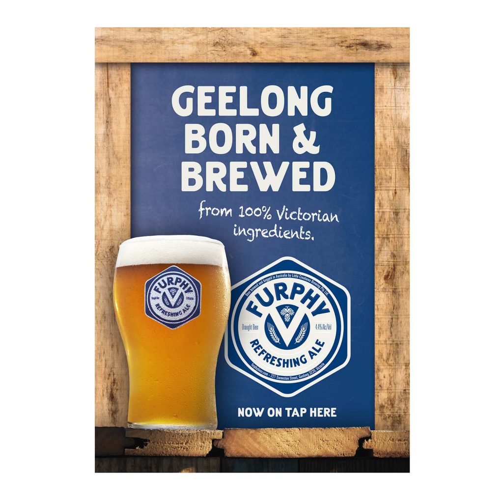
In 2013 Little Creatures expanded operations to Geelong. In recognition of their new home, they wanted to create a beer for the local community that was 100% Victorian sourced and brewed. It would be an easy-drinking ale that introduced mainstream beer drinkers to the full flavoured world of Little Creatures.
Position
Little Creatures has always had a strong sense of place. Their iconic Pale Ale was entwined with Fremantle, where it was first brewed and embraced. It was important that their debut east coast offering, Furphy, create pride in a Geelong born and bred beer.
Brand Promise
Local flavour
Ideate
The brand name pays tribute to J. Furphy & Sons, the Victorian company that makes beer tanks for Little Creatures’ breweries. During WWI, soldiers would gather around Furphy water tanks to swap stories and rumours. The stories would become embellished with every re-telling until eventually they became a furphy. True story.
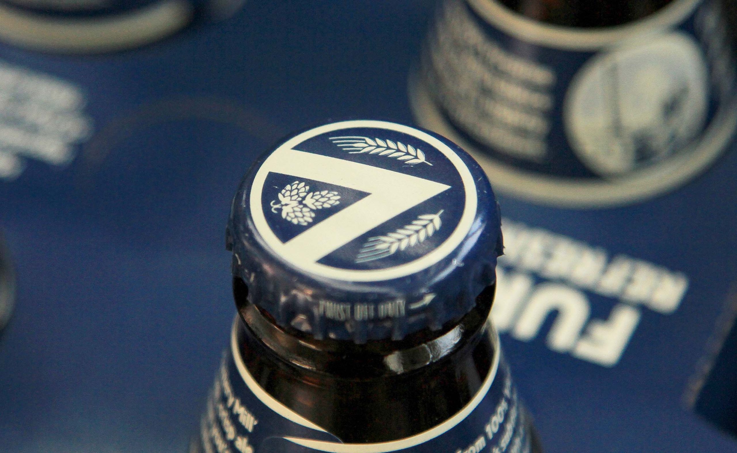
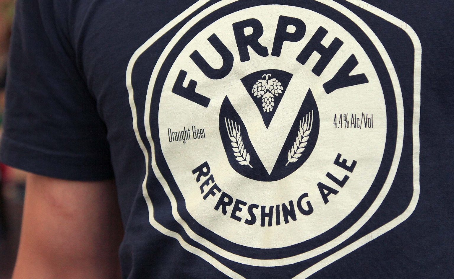
The brand identity pays tribute to Furphy’s 100% Victorian ingredients, with a ‘V’ icon forming a coat of arms flanked by wheat and hops.
PLAN / Implement
Craft beer is all about discovery. In-venue point of sale helped create grassroots awareness and a sales presenter ensured bar staff knew the story behind he beer and its memorable name.
The product launch exceeded initial sales targets by 300%, is the second biggest selling beer on tap at Little Creatures Geelong, and has national distribution on and off premise across Australia.